\[ \newcommand{\nRV}[2]{{#1}_1, {#1}_2, \ldots, {#1}_{#2}} \newcommand{\pnRV}[3]{{#1}_1^{#3}, {#1}_2^{#3}, \ldots, {#1}_{#2}^{#3}} \newcommand{\onRV}[2]{{#1}_{(1)} \le {#1}_{(2)} \le \ldots \le {#1}_{(#2)}} \newcommand{\RR}{\mathbb{R}} \newcommand{\Prob}[1]{\mathbb{P}\left({#1}\right)} \newcommand{\PP}{\mathcal{P}} \newcommand{\iidd}{\overset{\mathsf{iid}}{\sim}} \newcommand{\X}{\times} \newcommand{\EE}[1]{\mathbb{E}\left[{#1}\right]} \newcommand{\Var}[1]{\mathsf{Var}\left({#1}\right)} \newcommand{\Ber}[1]{\mathsf{Ber}\left({#1}\right)} \newcommand{\Geom}[1]{\mathsf{Geom}\left({#1}\right)} \newcommand{\Bin}[1]{\mathsf{Bin}\left({#1}\right)} \newcommand{\Poi}[1]{\mathsf{Pois}\left({#1}\right)} \newcommand{\Exp}[1]{\mathsf{Exp}\left({#1}\right)} \newcommand{\SD}[1]{\mathsf{SD}\left({#1}\right)} \newcommand{\sgn}[1]{\mathsf{sgn}} \newcommand{\dd}[1]{\operatorname{d}\!{#1}} \]
1.3 ggplot2 Data Visualization
“The goal is to turn data into information and information into insight.”
— Carly Fiorina
This part will give you an understanding of data visualization using ggplot2. R does have many packages/methods to make graphs, infact base-R has plot, histogram etc. (as you have seen in the Data section) for plottig but ggplot2 is one of the most versatile one. It implements grammar of graphics, a powerful tool to describe and build the components of graphs concisely. If you are curious and want to get in-depth understanding of grammar of graphics in ggplot2 you can read The Layered Grammar of Graphics by Hadley Wickham.
First install tidyverse which includes the ggplot2 package. Add it to the current workspace.
A package needed to be installed once, but it needs to be (re)loaded in every new session.
1.3.1 Components of ggplot2
ggplot2 plots the data unifying several different components5. Let’s start from the basics.
midwest dataset
midwest is a dataset in tidyverse, which contains demographic information of midwest counties collected in 2000 US census.
Run help: ?midwest to get details.
Our first ggplot
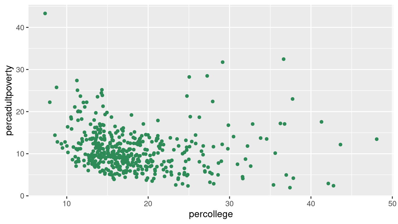
Let’s plot the relationship between percollege and percadultpoverty variable in midwest dataset. Run this code (it puts the variables in x and y axis respectively):
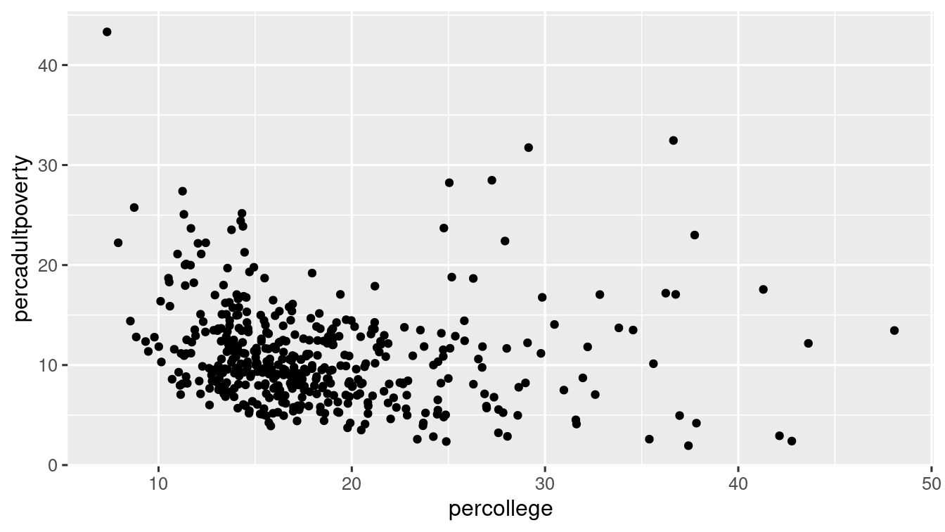
The plots shows negative relationship between Percent of college educated people(percollege) and Percent of adults below poverty line(percadultpoverty).
In ggplot2, you need to begin with a function ggplot() which creates a coordinate system that you can add layers to. The first arugment is data (the dataset to use in the graph). The code: ggplot(data = midwest) creates an empty graph (not really interesting! check it yourself).
geom_point() function adds a layer of points to your plot to make a scatter. The geom functions which comes with ggplot2, add different kind to layers to a plot. Each geoms takes a mapping argument which tells how variables in your dataset are mapped to visual properties. The mapping argument is always paired with aes() and the x,y arguments of aes().
A template for graphing
Every ggplot is made with a common template. While coding, replace the angle-bracketed sections in the code with proper arguments:
<DATA>: a dataset to use in your plot<GEOM_FUNCTION>: a geom function<MAPPINGS>: a set of mappings
These 3 are compulsory arguments to every ggplot. You’ll learn in the later subsections how to complete and extend this basic template to make different types of graphs.
1.3.2 Aesthetics
Take a look at the graph below.
ggplot(data = midwest) +
  geom_point(mapping = aes(
    x = percollege,
    y = percadultpoverty,
    colour = state
  ))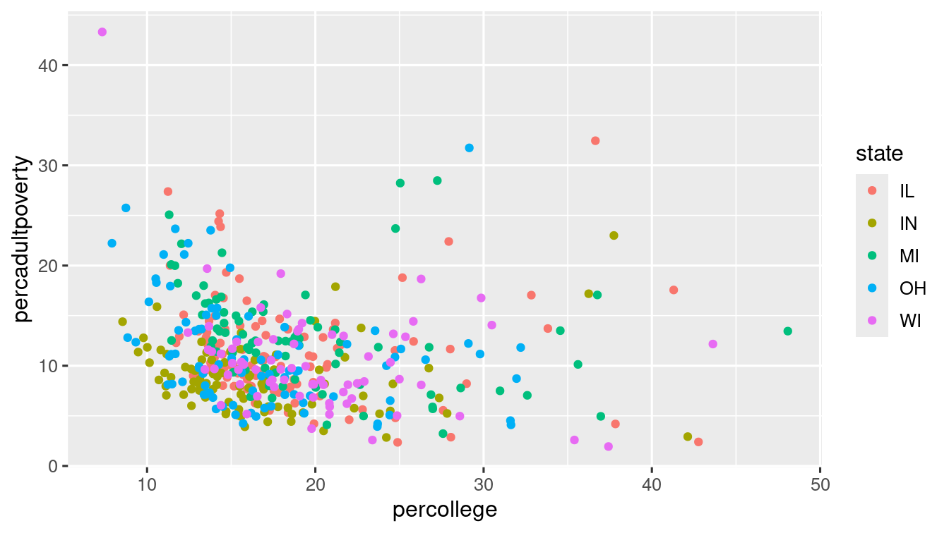
colour = state is added by mapping it to an aesthetic called colour to for distinct values of state variable.
The visual property of the objects you plot is called an aesthetic. It contains the information of plotting axes of variables and size, shape, color of points. By changing the aesthetic properties you can percollegeay points in other different ways.
aes() in ggplot
aes() associates the name of the aesthetic to the name of the variable. the function gathers together each of the aesthetic mappings used by a layer and passes them to the layer’s mapping argument. It is clever enough to select a reasonable scale to use with the aesthetic, and it also constructs a legend (or axis labels) that explains the mapping between levels and values.
In the above example, the name of the aesthetic was colour and name of the variable is state. ggplot2 smartly assigns a unique level of the aesthetic colour to a unique level to the variable state. This process of unique association is called Scaling.
Let’s look at some more examples.
- The geom allows us to set the aesthetic properties manually (without putting inside
aes()). However, it can’t convey information about a variable. It just changes the overall the plot.
ggplot(data = midwest) +
  geom_point(
    mapping = aes(
      x = percollege,
      y = percadultpoverty
    ),
    colour = "seagreen"
  )
As you can see in this example, colour = "blue" changes the colour of all points to blue.
- The
alphaaesthetic: It handles the tranparency of points
ggplot(data = midwest) +
  geom_point(mapping = aes(x = percollege, y = percadultpoverty, alpha = category))
#> Warning: Using alpha for a discrete variable is not advised.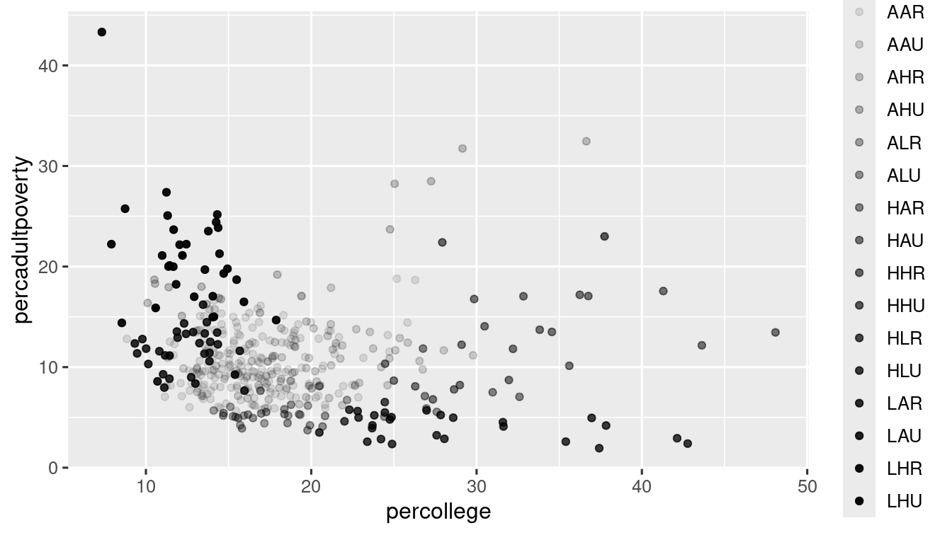
- The
shapeaesthetic: As the name suggests it controls the shape of the points
ggplot(data = midwest) +
geom_point(mapping = aes(x = percollege, y = percadultpoverty, shape = category))
#> Warning: The shape palette can deal with a maximum of 6 discrete values because more
#> than 6 becomes difficult to discriminate
#> ℹ you have requested 16 values. Consider specifying shapes manually if you need
#> that many have them.
#> Warning: Removed 119 rows containing missing values or values outside the scale range
#> (`geom_point()`).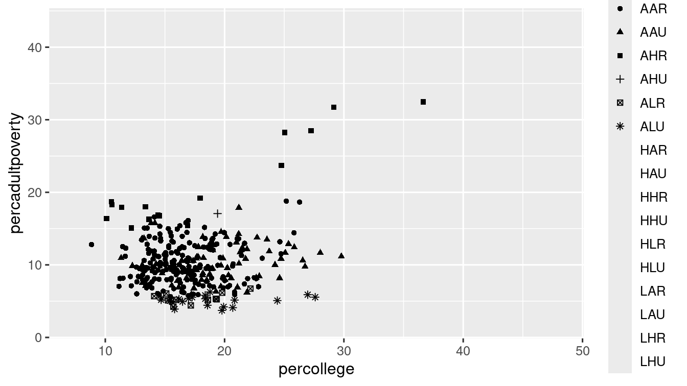 Unfortunately,
 ggplot2 plots only 6 different shapes in a plot! And as a result the additional categories gets ommited (as you can see in the warning message!).
1.3.3 Facets (wrap and grid)
The scatter-plot of percollege vs percadultpoverty, coloured for different catogories, is not good for observing data for different categories. One way to deal with this problem, is to split the plot into factes, a set of subplots each displaying a subset of data. ggplot2 contains two such facet functions
With facet_wrap(), you can split plot with a single variable, which can be done with ~ followed by the variable name.
ggplot(data = midwest) +
  geom_point(mapping = aes(
    x = percollege,
    y = percadultpoverty,
    colour = state
  )) +
  scale_colour_viridis_d(option = "plasma") +
  facet_wrap(~state, nrow = 2)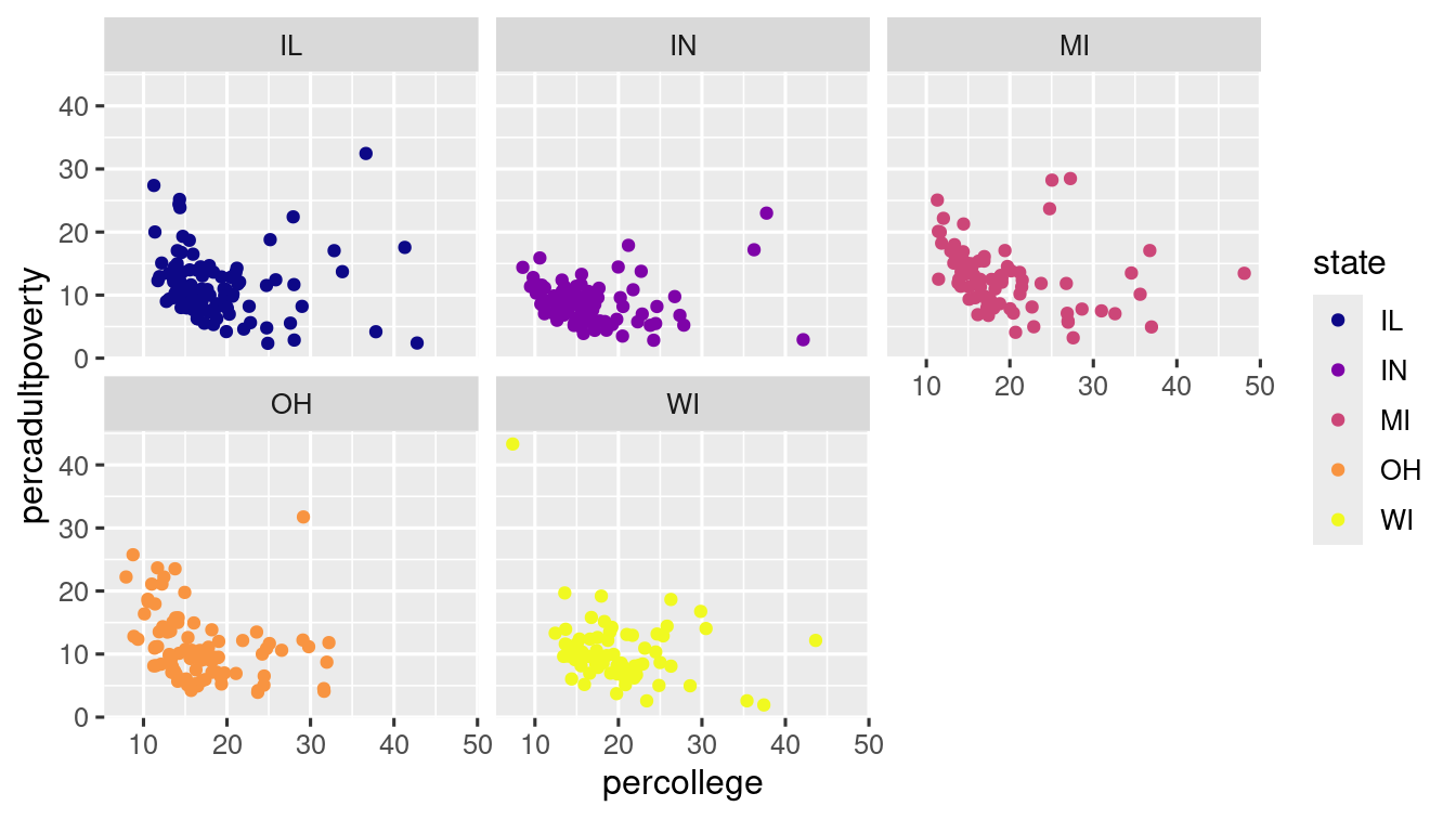
Another fucntion, facet_grid() is used to facet the plot on the combination of two variables. And, as you have alredy guessed, this time the variable names must have to be seperated by ~.
ggplot(data = midwest) +
  geom_point(
    mapping = aes(
      x = percollege,
      y = percadultpoverty,
      colour = category
    )
  ) +
  scale_colour_viridis_d(option = "plasma") +
  facet_grid(state ~ inmetro)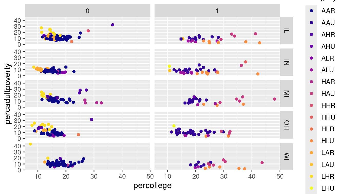
If you want to facet in the rows or columns dimension, use . in place of variable name.
ggplot(data = midwest) +
  geom_point(mapping = aes(
    x = percollege,
    y = percadultpoverty,
    colour = state
  )) +
  scale_colour_viridis_d(option = "plasma") +
  facet_grid(state ~ .)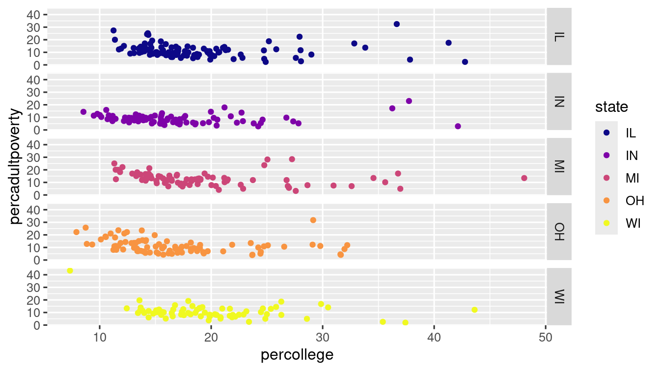
The variable passed to facet functions must be discrete!
1.3.4 Geometrical objects
Geometric objects in ggplot2 are visual structures that are used to visualize data, in other words, a way to describe the type of plot we want. These are called geoms. For example,
- bar-charts uses bar geoms:
geom_bar(),geom_col() - line-charts uses line geoms:
geom_smooth() - box-plot uses boxplot geoms:
geom_boxplot() - scatter-plot uses point geoms:
geom_point()
Let’s look at bar charts
Histograms: geom_histogram()
Histograms are used to visualise the distribution of a numeric variable. So takes numeric inputs only. It plots in the following way:
- First specifies a sequence of points, called breaks.
- It counts the number of observation between the breaks, called bins.
- Places a bar in each bin with
basebeing the length of the bin andheightdetermined by either the frequency or proportion of observations in the bin.
# left
ggplot(data = midwest, mapping = aes(x = percollege, fill = state)) +
  geom_histogram() +
  scale_fill_viridis(discrete = TRUE)

# right
ggplot(data = midwest, mapping = aes(x = percollege, fill = state)) +
  geom_histogram(binwidth = 5) +
  scale_fill_viridis(discrete = TRUE)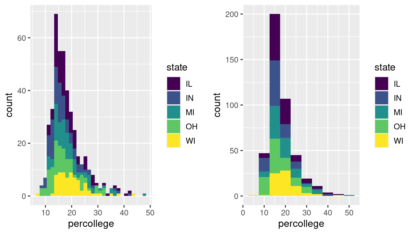
By default, ggplot2 picks a suitable binwidth but you can specify it explicitely.
Bar Charts for categorical data: geom_bar() & geom_col()
A bar chart is a graph where for each category a bar with a height proportional to the count in the respective category is drawn. And the categories (or levels) are displayed along x-axis.
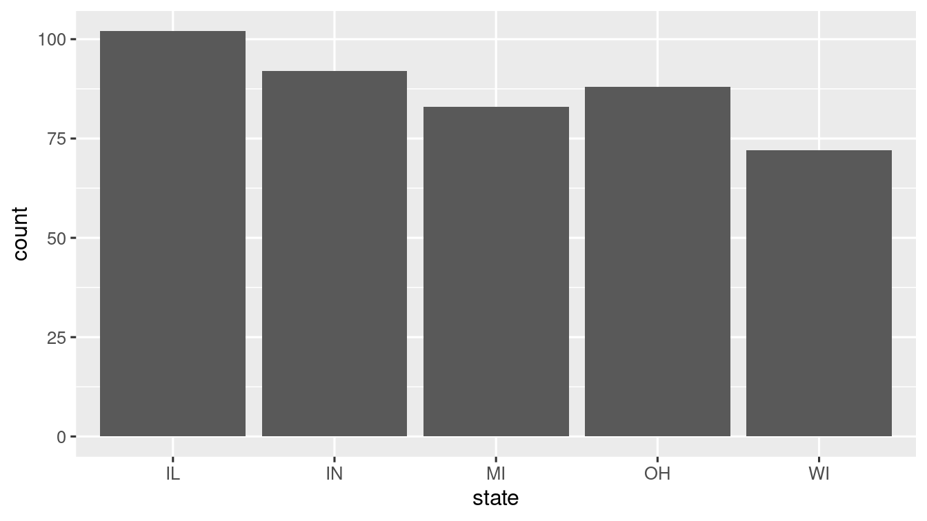
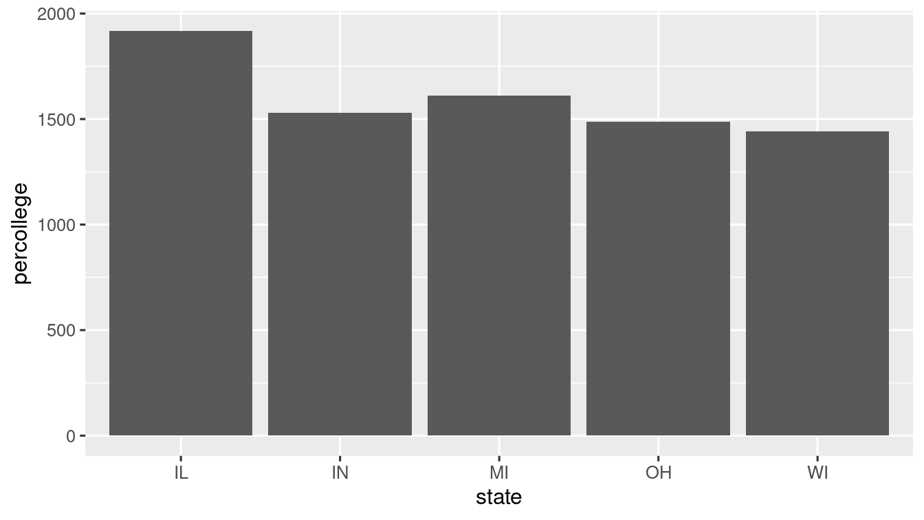
geom_bar() plots the bar with height proportional to the total count in each group. What if we want the heights of the bars to represent values in the data? The answer is geom_col().
1.3.5 Statistical transformations
Plotting raw data does not always yield good insights. It is often useful to transform the data before plotting. This is where the stat_ functions comes into picture. As the name suggest, you can do some statistical computation to get more meaningful plots.
As you have seen above, the bar chart displays total number of counties in the midwest dataset, grouped by category. The midwest dataset in ggplot2 contains information about 437 counties.
On the x-axis the chart displays category (a variable in midwest) and on the y-axis, it displays count, but count is not a variable in midwest! Where does it come from? Some graphs, like scatter-plots, plot the raw values of the dataset. Some graphs, like bar-charts calculate new values to plot:
- bar charts, histograms, and frequency polygons bin your data and then plot bin counts, the number of points that fall in each bin.
- smoothers fit a model to your data and then plot predictions from the model.
- boxplots compute a robust summary of the distribution and then display a specially formatted box.
An algorithm, stat (Statistical transformations) is used to calculate these values.
If you would like to override the default stat. You can try stat = "identity"
table_midwest_state <- as.data.frame(
  table(midwest$state),
  col.names = c("state", "count")
)

ggplot(data = table_midwest_state) +
  geom_bar(mapping = aes(x = Var1, stat = "identity"))
#> Warning in geom_bar(mapping = aes(x = Var1, stat = "identity")): Ignoring
#> unknown aesthetics: stat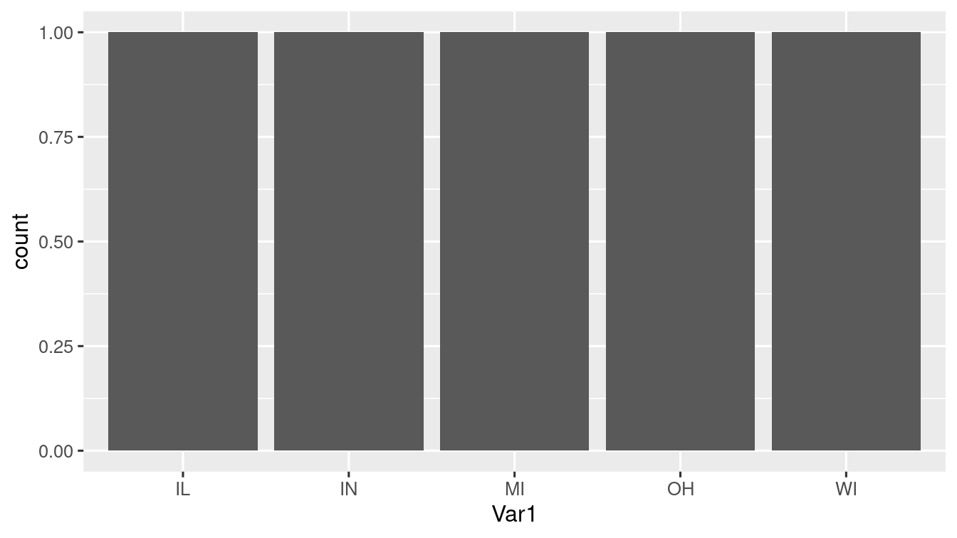
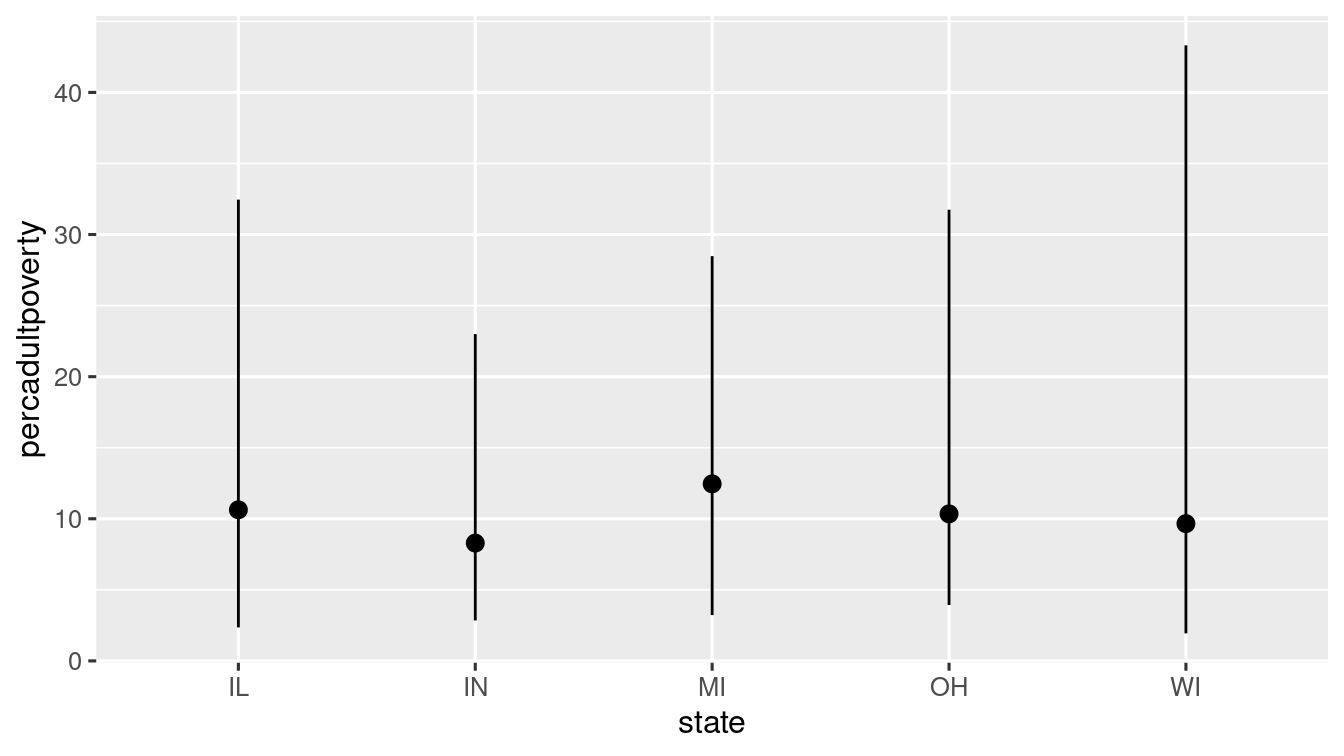
ggplot(data = midwest) +
  stat_summary(
    mapping = aes(x = state, y = percadultpoverty),
    fun.min = min,
    fun.max = max,
    fun = median
  )
1.3.6 Adjusting Position
fill and colour aesthetics
Normal bar charts doesn’t give much of information. You can use the fill = and color = (or colour =) aesthetics to colour them.
# Not interesting 😕
ggplot(data = midwest) +
geom_bar(mapping = aes(x = state, colour = state)) +
scale_fill_viridis_d()
# Looks good 😃
ggplot(data = midwest) +
geom_bar(mapping = aes(x = state, fill = state)) +
scale_fill_viridis_d()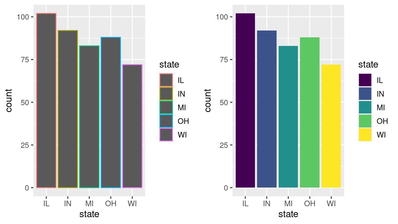 When another variable is mapped to
 fill =, you will get a set of stacked bars. Each coloured rectangle shows a combination of both the variables (here, state and category).
ggplot(data = midwest) +
  geom_bar(mapping = aes(x = state, fill = category)) +
  scale_fill_viridis_d()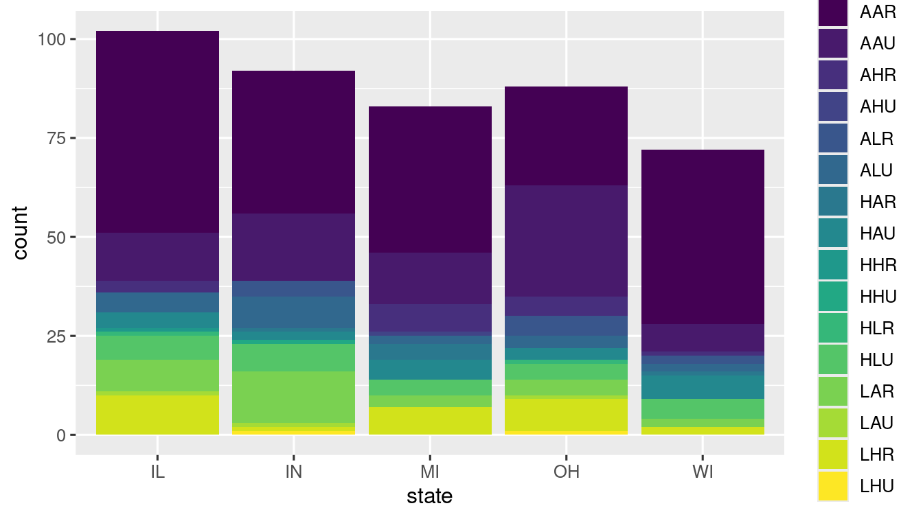
Options for bar cahrts
To get more clear view about the count of each category you might need to see the plot in a different view.
position = "dodge"Overlapping bars beside one another
ggplot(data = midwest) +
geom_bar(
mapping = aes(x = state, fill = category),
position = "dodge"
) +
scale_fill_viridis_d()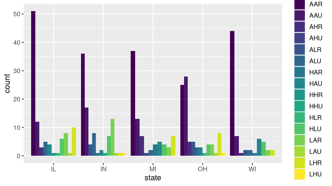 -
- position = "fill" Stacking but each bars have same height
ggplot(data = midwest) +
geom_bar(
mapping = aes(x = state, fill = category),
position = "fill"
) +
scale_fill_viridis_d()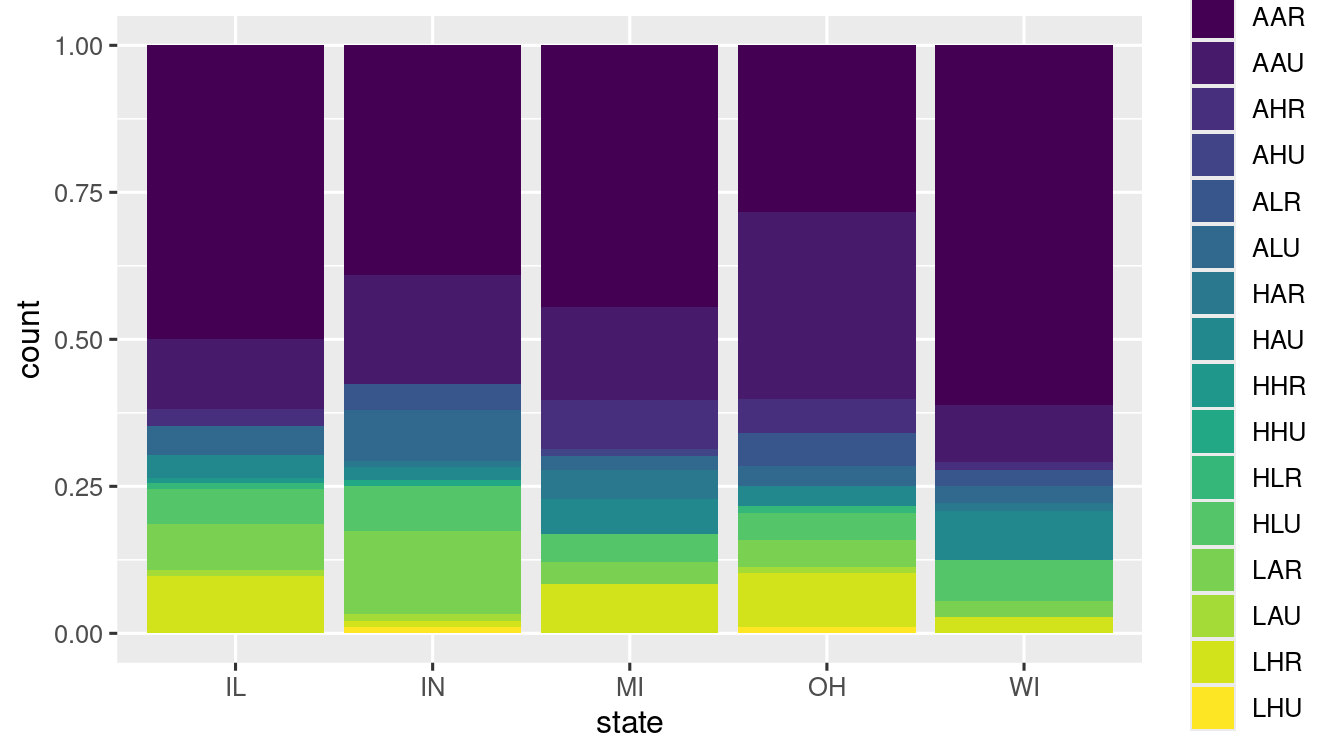 -
- position = "identity" Places each object where it falls in the context of the graph, which creates problem of overlappiing!
ggplot(data = midwest) +
  geom_bar(
    mapping = aes(x = state, fill = category),
    position = "identity"
  ) +
  scale_fill_viridis_d()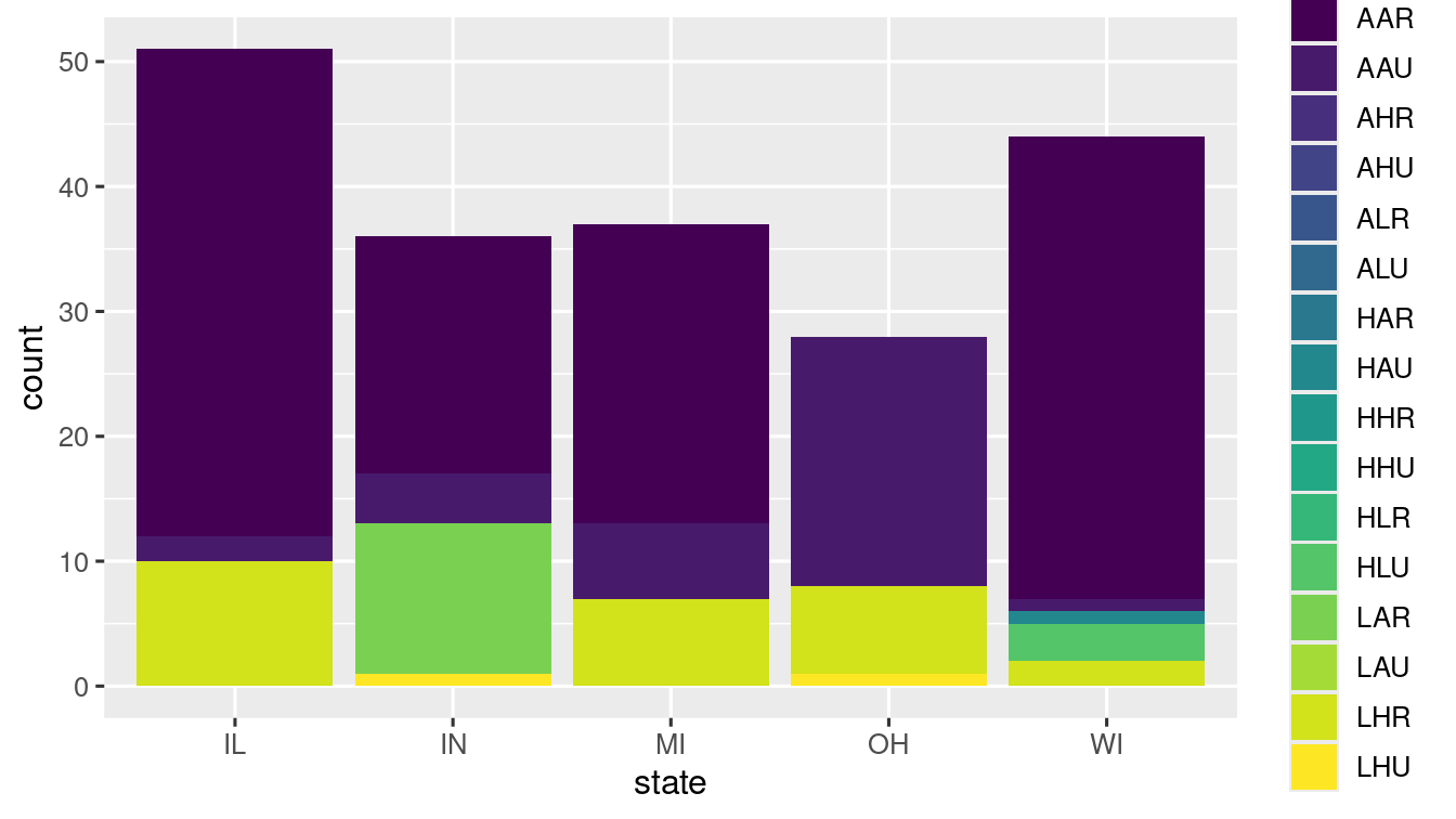
To avoid it, use tranparency
ggplot(data = midwest) +
  geom_bar(
    mapping = aes(x = state, colour = category),
    position = "identity",
    fill = NA
  ) +
  scale_fill_viridis_d()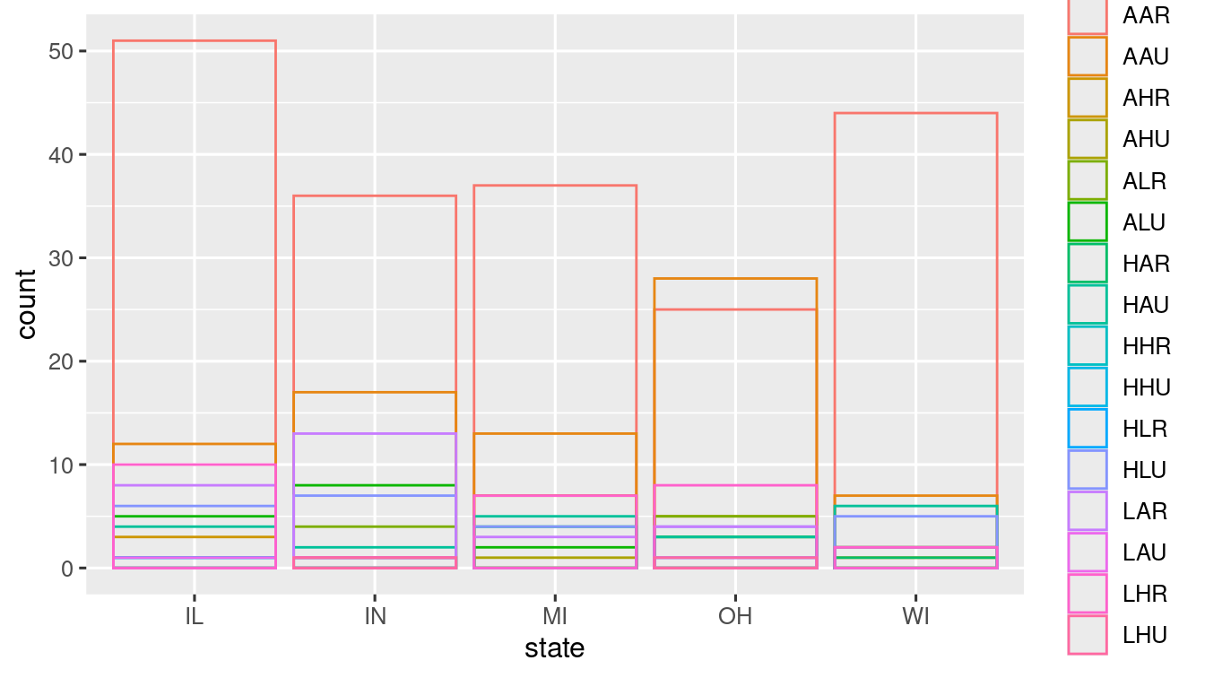
Learn more about the position adjustments at their docs.
1.3.7 Coordinate systems
By default, ggplot2 plots in cartesian coordinate system. Sometimes other coordinate systems would be helpful for more insights.
coord_flip(): Flips coordinate, i.e., switches x and y axes. Helpful for long labels
ggplot(data = midwest) +
geom_bar(mapping = aes(x = state, fill = state)) +
scale_fill_viridis_d() +
coord_flip()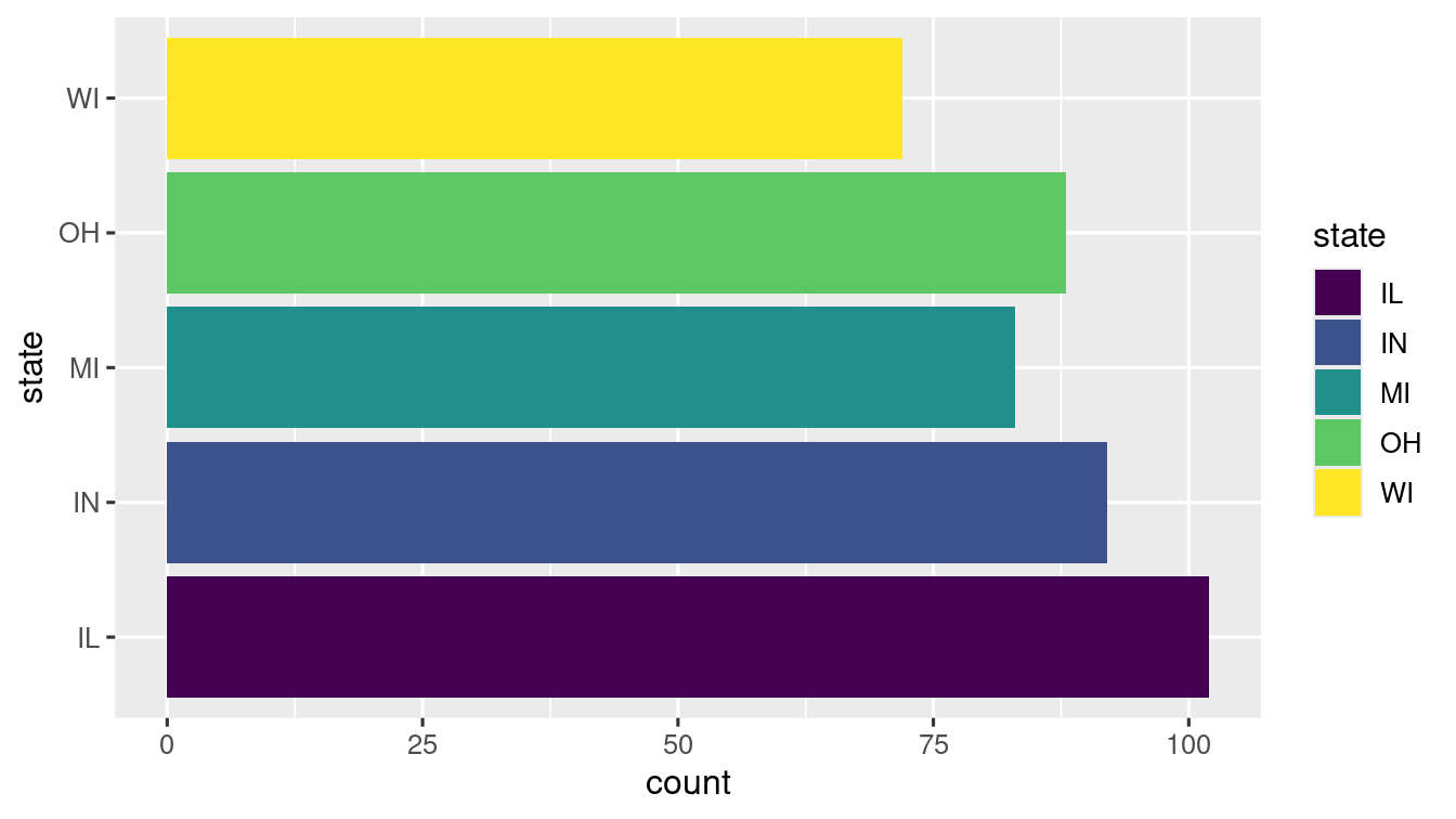 -
- coord_polar(): Transforms into polar coordinate system.
ggplot(data = midwest) +
  geom_bar(mapping = aes(x = state, fill = state)) +
  scale_fill_viridis_d() +
  coord_polar()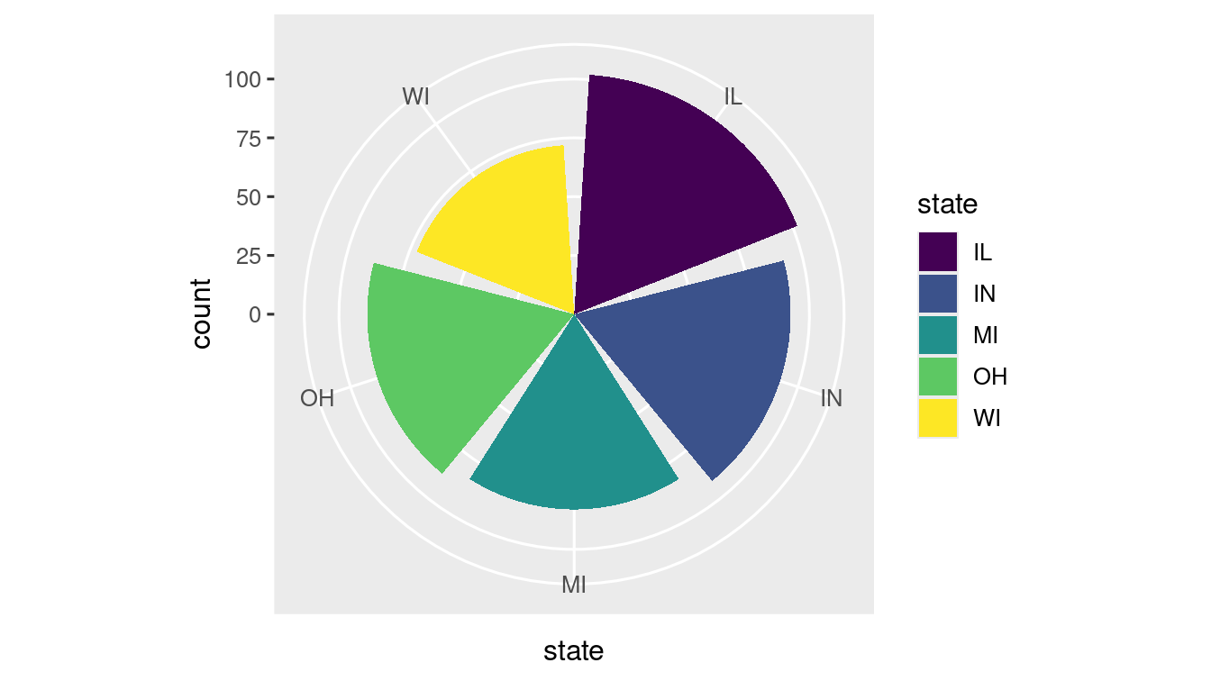
Boxplot
A boxplot
ggplot(data = midwest, mapping = aes(x = state, y = percadultpoverty)) +
geom_boxplot()
# Boxlot with flipped coordinate
ggplot(data = midwest, mapping = aes(x = state, y = percollege)) +
geom_boxplot() +
coord_flip()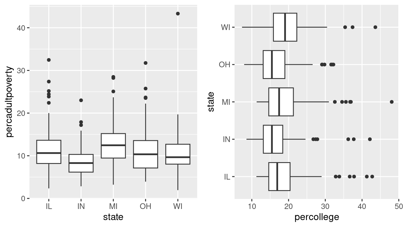 Boxplot for only one
ggplot(
  data = filter(midwest, state == "OH"),
  mapping = aes(x = state, y = percollege)
) +
  geom_boxplot() +
  coord_flip()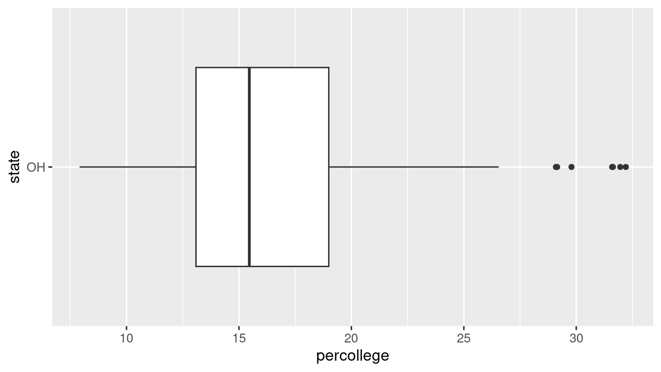
1.3.8 Seven layers of gg (grammar of graphics)
As you have learnt in this chapter, the whole structure of a ggplot is basically consist of 7 components which can be understood in the following template:
ggplot(data = <DATA>) +
  <GEOM_FUNCTION>(
     mapping = aes(<MAPPINGS>),
     stat = <STAT>,
     position = <POSITION>
  ) +
  <COORDINATE_FUNCTION> +
  <FACET_FUNCTION> +
  <THEME>
Rarely, you will specify all the 7 components, but data, geom and aesthetic mappings are must. ggplot2 will assign rest of them suitably.
1.3.9 Learn More
As you look at more and more examples of code, you will get a good grab in basic R programming. The following set of links may be helpful for your future data visualization works. Explore!
Wonderful collection of ggplots
- The R Graph Gallery - Help and inspiration for R charts
- R Charts
- R Graphics Cookbook
- Top 50 ggplot2 Visualizations - The Master List
- Data, movies and ggplot2
- Comparing ggplot2 and R Base Graphics | FlowingData
- Be Awesome in ggplot2: A Practical Guide to be Highly Effective - R software and data visualization - Easy Guides - Wiki - STHDA
Exercises
Exercise 1.12 geom_smooth() function: After loading library tidyverse execute the following command:
Understand (as best as possible) what curve the code is drawing. Add the following aesthetic mappings using variable category ainmetroexplain the plot in each case:
linetypegrouplinetypecolour(useviridisscale filling)
Exercise 1.13 Write a R-code that produces one plot in which : there is a scatter plot of percollege vs percadultpoverty using state for colour (again viridis) and over layered on it a best fit line using geom_smooth() for the midsize cars.
Exercise 1.14 Go to https://data.incovid19.org and write out a one paragraph description of what the data set contains. Download data set from: https://data.incovid19.org/csv/latest/states.csv. Using read.csv() function, load states.csv in R into a dataframe called state_df.
Pick a state of India which has the same starting letter as the starting letters in your first, middle or last name. For example: Siva Athreya could pick Arunachal Pradesh.
Subset the dataframe
state_dfto have only data from the state that you picked in the previous step and call the resulting dataframe asmystate_dfUsing
mystate_dfcompute the daily active cases for the state. Then plot a line chart usinggeom_line()for the same from the date you started states in ,viridiscolored by date. Provide the following:- Title as “Active cases for State - name_of_the_state”
- x-label - “Dates”
- y-label - “Cases”
- x-ticks to be dates.
Using
mystate_dfcompute the total Deceased figures for each month since March 2020 till date. Then plot a bar chart usinggeom_bar()of the monthly Deceased totals,viridiscolored by month. Provide the following:- Title as “Monthly Deceased Totals for State - name_of_the_state”
- x-label - “Months”
- y-label - “Deceased Total”
- x-ticks to be names of months.
Using
state_dfcompute the total Confirmed cases and total Deceased for each state since March 2020 till date. Then plot a scatter usinggeom_point()of the total confirmed cases of the states versus total deceased figures;viridiscolored by state. Provide the following:- Title as “Scatter Plot of Confirmed Versus Deceased”
- x-label - “Deceased Figures”
- y-label - “Confirmed Cases”.
Can you label the dots with the State names?
Exercise 1.15 Examine the structure of the inbuilt dataset iris. How many observations and variables are in the dataset? Using ggplot() produce the following scatter plot: