\[ \newcommand{\nRV}[2]{{#1}_1, {#1}_2, \ldots, {#1}_{#2}} \newcommand{\pnRV}[3]{{#1}_1^{#3}, {#1}_2^{#3}, \ldots, {#1}_{#2}^{#3}} \newcommand{\onRV}[2]{{#1}_{(1)} \le {#1}_{(2)} \le \ldots \le {#1}_{(#2)}} \newcommand{\RR}{\mathbb{R}} \newcommand{\Prob}[1]{\mathbb{P}\left({#1}\right)} \newcommand{\PP}{\mathcal{P}} \newcommand{\iidd}{\overset{\mathsf{iid}}{\sim}} \newcommand{\X}{\times} \newcommand{\EE}[1]{\mathbb{E}\left[{#1}\right]} \newcommand{\Var}[1]{\mathsf{Var}\left({#1}\right)} \newcommand{\Ber}[1]{\mathsf{Ber}\left({#1}\right)} \newcommand{\Geom}[1]{\mathsf{Geom}\left({#1}\right)} \newcommand{\Bin}[1]{\mathsf{Bin}\left({#1}\right)} \newcommand{\Poi}[1]{\mathsf{Pois}\left({#1}\right)} \newcommand{\Exp}[1]{\mathsf{Exp}\left({#1}\right)} \newcommand{\SD}[1]{\mathsf{SD}\left({#1}\right)} \newcommand{\sgn}[1]{\mathsf{sgn}} \newcommand{\dd}[1]{\operatorname{d}\!{#1}} \]
3.6 Bivariate Data
For example,
- Maternal Smoking and its effect on Birth Weight
- Attendance in Classes and its e↵ect on Scores in an Exam.
- Age and Heart rate
- Effect of Vitamin C on Toothgrowth
This section focuses on the analysis of two variables and their relationship. Bivariate data refers to a collection of paired observations or measurements on two different variables. Here we explores various techniques and methods used to understand and analyze the interaction, association, and patterns between these variables. By studying bivariate data, we gain insights into how changes in one variable relate to changes in the other, allowing us to make predictions, identify trends, and uncover meaningful connections. Understanding bivariate data is crucial in many fields, including social sciences, economics, medicine, and environmental studies, as it enables researchers and practitioners to make informed decisions and draw valuable conclusions based on the joint behavior of variables.
Many data consists of two variables. One of them is a Independent Variable, also known as Predictor or Explanatory variable. And the other one being a Dependent Variable (a.k.a. Response Variable). There are situations when there is one response variable and multiple explanatory variables. We will not discuss them in this course. We will focus on Bivariate Data.
Let’s analyze the baby dataset.
baby_df <- read.table(
  file = "../../assets/datasets/baby.data",
  header = TRUE
)

head(baby_df)
#>   bwt smoke
#> 1 120     0
#> 2 113     0
#> 3 128     1
#> 4 123     0
#> 5 108     1
#> 6 136     0
unique(baby_df$smoke)
#> [1] 0 1 9
baby_df$number <- 1:1236
Observe the scatter plot of birth weight (bwt)
ggplot(data = baby_df) +
  geom_point(
    aes(
      x = number,
      y = bwt,
      colour = as.factor(smoke)
    )
  ) +
  scale_colour_viridis_d(option = "plasma")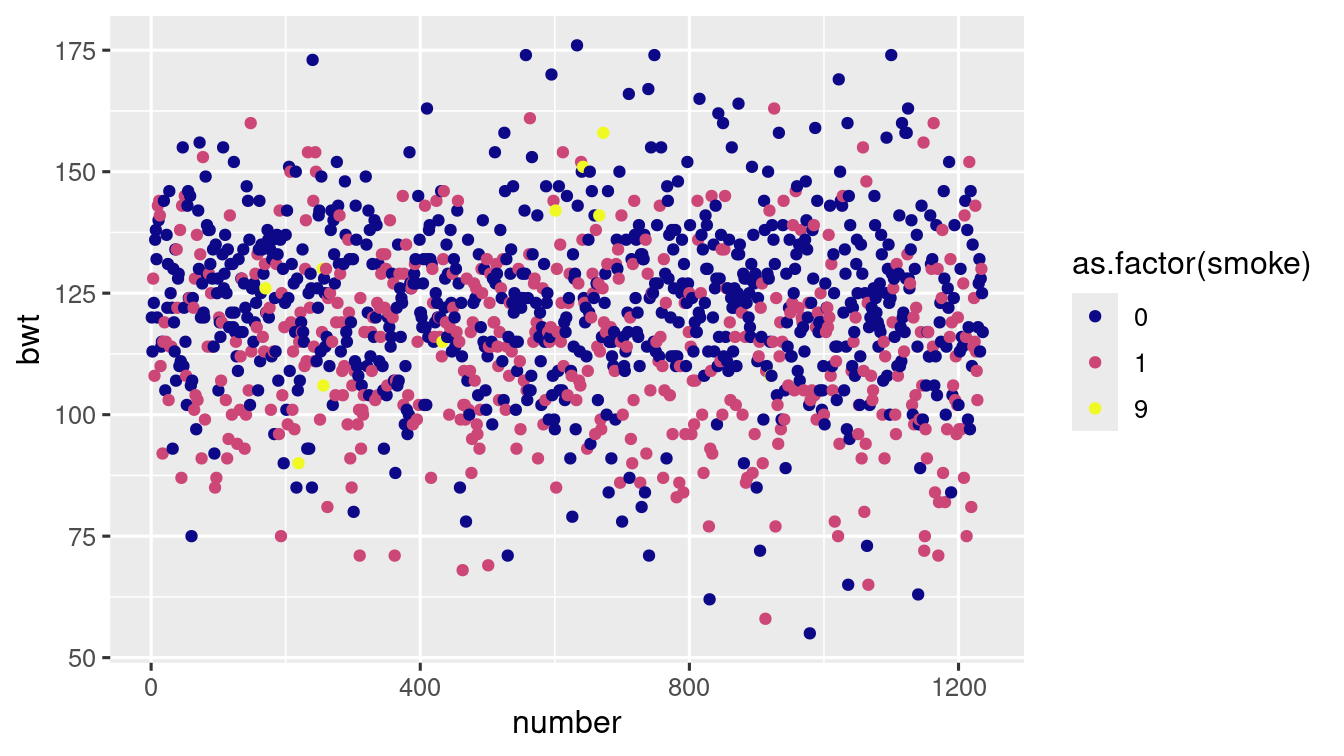
ggplot(
data = baby_df,
aes(x = bwt, fill = as.factor(smoke))
) +
geom_histogram(colour = "white") +
scale_fill_viridis_d()
#> `stat_bin()` using `bins = 30`. Pick better value with `binwidth`.
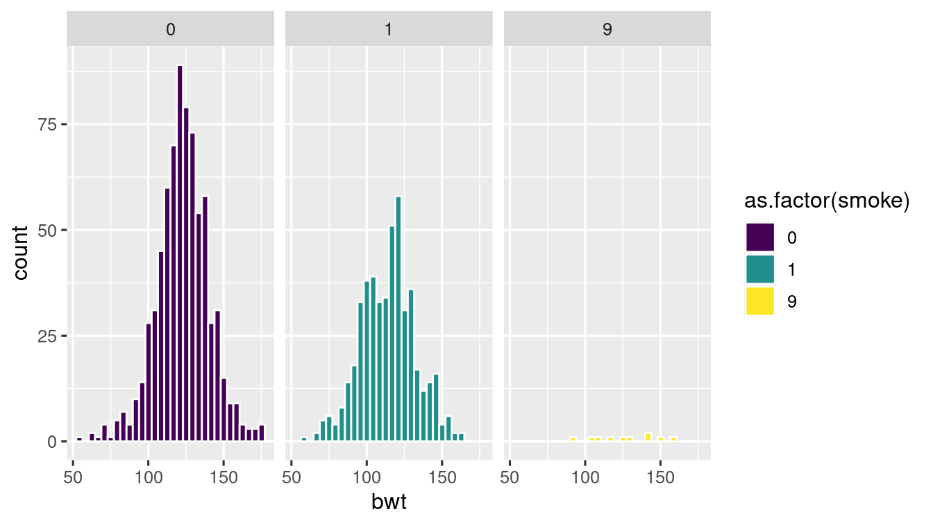
ggplot(
data = baby_df,
aes(x = bwt, fill = as.factor(smoke))
) +
geom_histogram(colour = "white") +
scale_fill_viridis_d() +
facet_wrap(
~ as.factor(smoke),
nrow = 1
)
#> `stat_bin()` using `bins = 30`. Pick better value with `binwidth`.
baby_df %>%
  ggplot(aes(
    x = as.factor(smoke),
    y = bwt,
    fill = as.factor(smoke)
  )) +
  geom_boxplot() +
  scale_fill_viridis_d()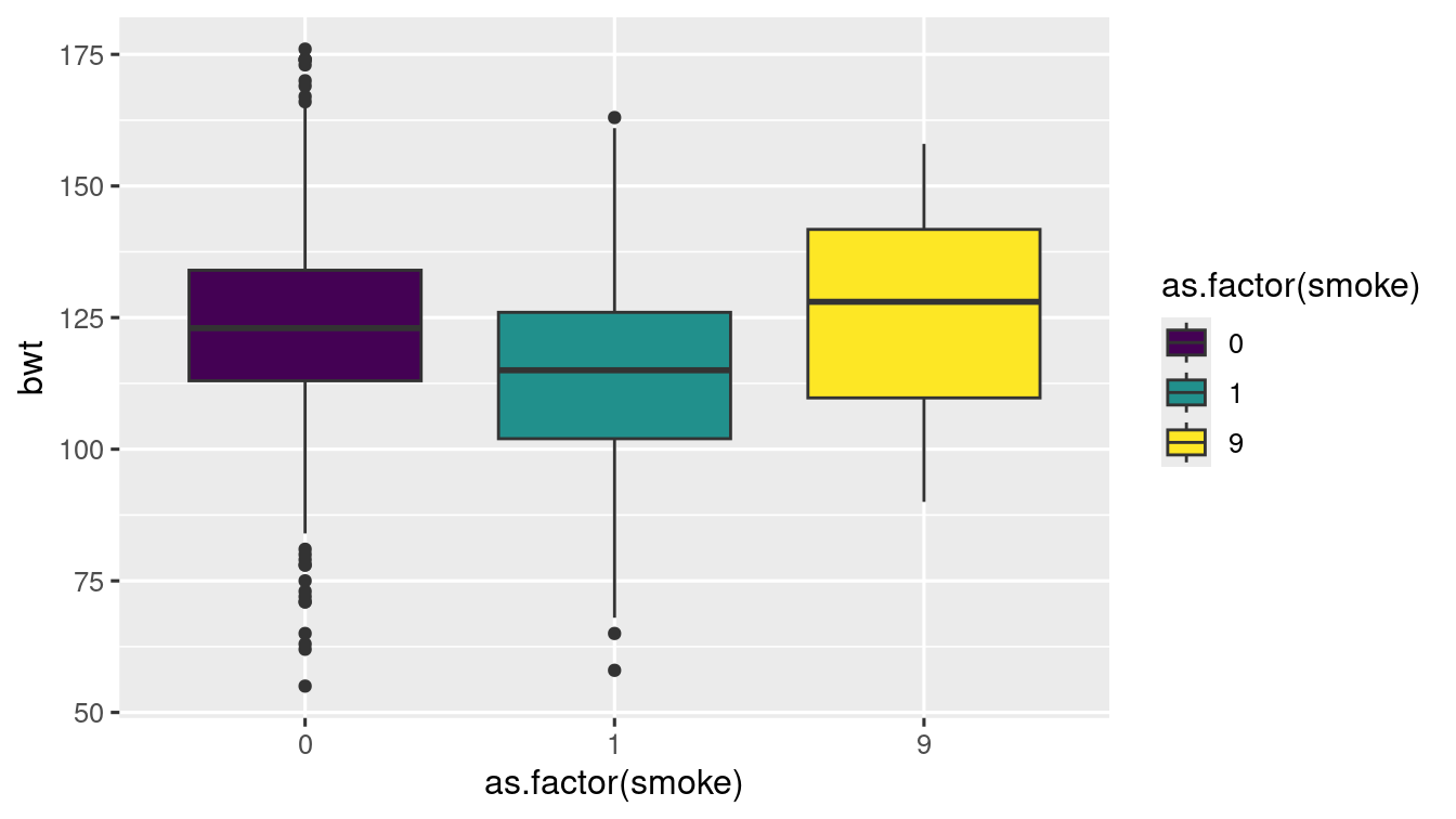
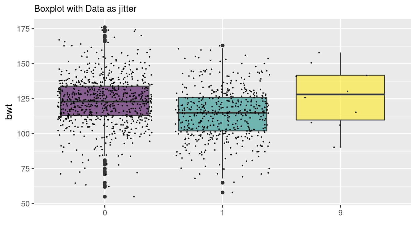
baby_df %>%
  ggplot(aes(
    x = as.factor(smoke),
    y = bwt,
    fill = as.factor(smoke)
  )) +
  geom_boxplot() +
  scale_fill_viridis(discrete = TRUE, alpha = 0.6) +
  geom_jitter(color = "black", size = 0.2, alpha = 0.9) +
  theme(
    legend.position = "none",
    plot.title = element_text(size = 11)
  ) +
  ggtitle("Boxplot with Data as jitter") +
  xlab("")